Mining Company
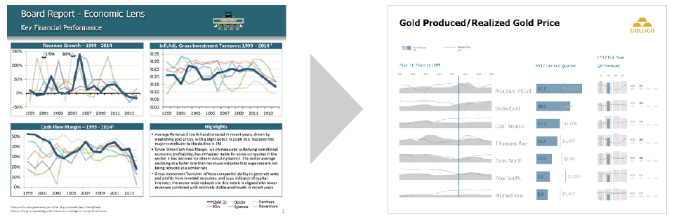
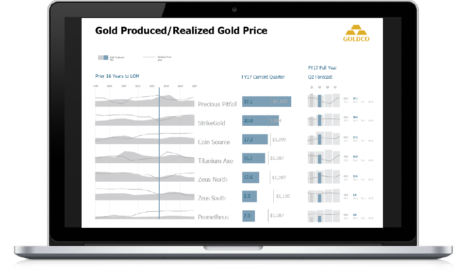
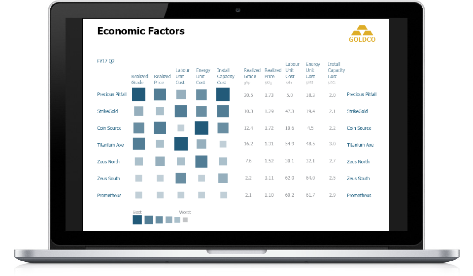
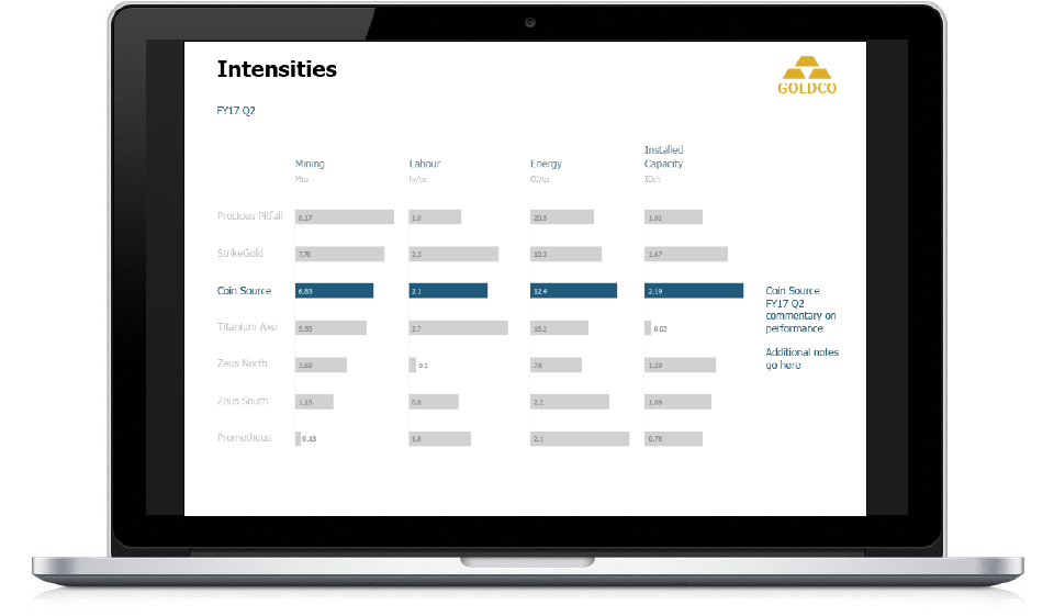
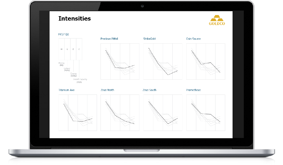
The engagement team wanted a visual update to their client’s performance reports, which covered metrics from the executive level and drilled down to the operational level. Shawn mocked up wireframes in Illustrator based on direction from creative director following brand guidelines and producing comps that showed key information clearly and made the information more easily readable. Providing clear visuals made it obvious that the story and messaging of the reports from the engagement team were unclear. This helped the engagement team realise they needed to go back and focus on those aspects before asking for just an aesthetic update.
The Team
Creative Director: Anthony D'Ugo
UX/UI Designer: Shawn Hao