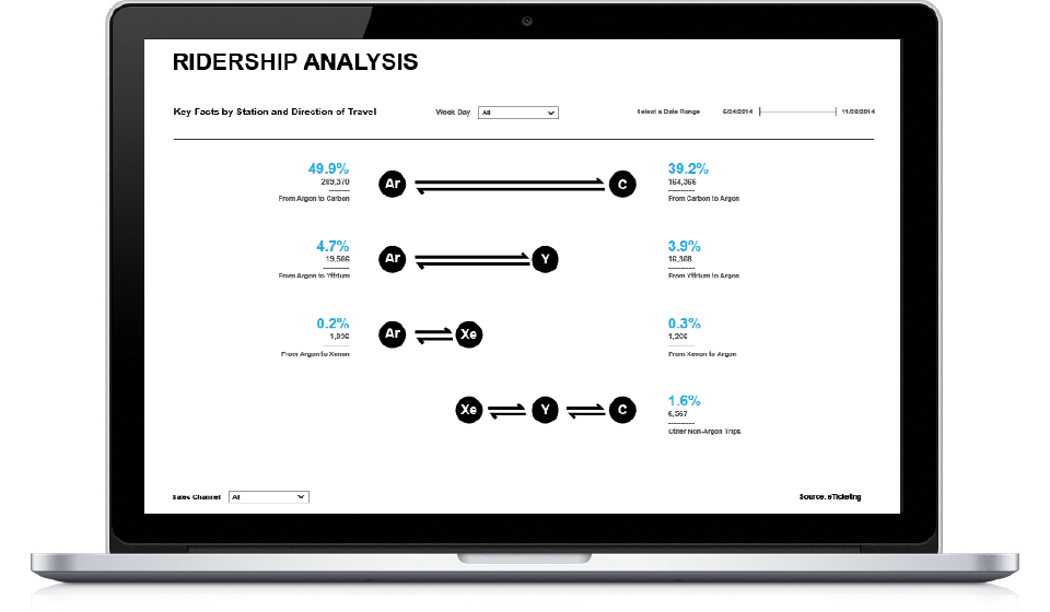
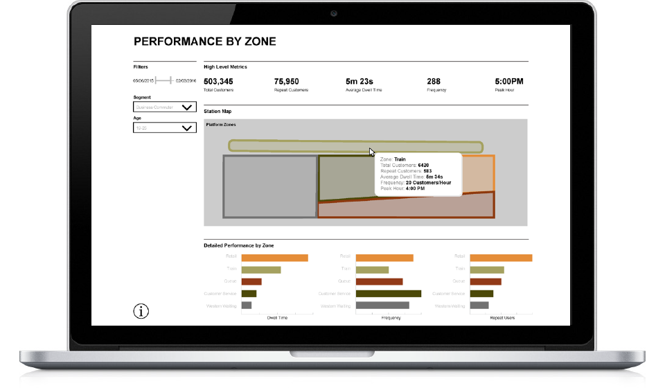
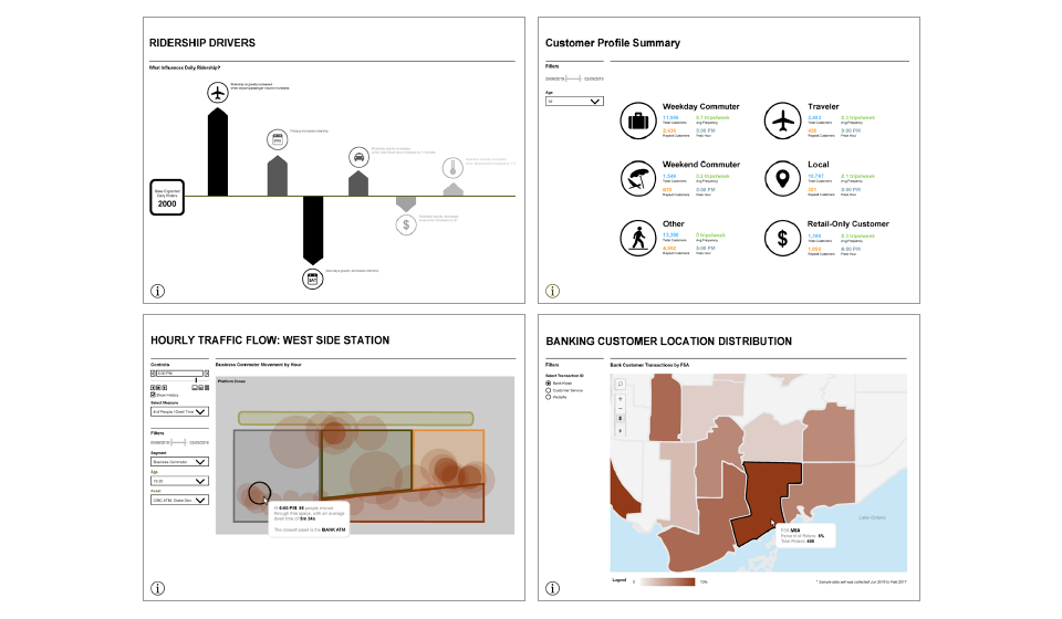
Public Transit

The client asked for a set of interactive dashboards showcasing ridership, ticket sales, and promotions. After the first set of successful dashboards, they engaged the team again in phase two to develop dashboards for social media and Wi-Fi data.

Shawn developed dashboards in Tableau and created visual assets based on designs provided by the creative/art director and the client’s branding. During phase two, he created mockups for the dashboards derived from phase one.

The client was pleased with the result and saw the value of having a data visualization tool, like Tableau. They continued to engage with the project team and moved forward with a follow up project to design and put into production a set of interactive dashboards in a different data viz tool.


The Team

Project Manager: Eric Bogart

Creative Director: Stefan Popowycz

Art Director / Lead Designer : Miki Arai

Lead Visualization Analyst : Dennis Pineda, Diana Whitcomb

Junior Visualization Analyst: Shawn Hao

For phase one, Shawn and the lead visualization analyst whiteboarded various kinds of ways to visualize the data. The lead visualization developed the initial few dashboards, while Shawn finished the rest. The final dashboards showed ridership over time, ticket sales by channel, and popular times/parts of the week.
Public Transit Interactive Dashboard

The Ridership Analysis screen was thought up by Shawn in trying to visualize the volume of traffic between stations, while maintaining the brand visuals. Riders may use the vehicles to make various kinds of trips, but it was useful to break down the trip directions visually to help the client see that the majority of trips made were between the farthest two stations (end to end.) Shawn created many of the visual assets used in the dashboards, including icons, station infographic (top left), and other infographics.
Public Transit Interactive Dashboard

For phase two, Shawn created all the mockups and worked with the lead visualization analyst to make sure the inventory of visuals was complete. After the mockups were created, they were handed off to another Tableau developer. Shawn’s Tableau activities in this phase were limited to making updates to and ensuring proper quality assurance for phase one. The data collected could show where users accessed and dwelled within the station, sectioned off into zones. In addition, the client partnered with a major bank to see where their customers were from locally.